library(tidyverse)
library(zoo)
library(RcppRoll)
library(gganimate)
library(shadowtext)College Football Bar Chart Races
college football
bar chart race
Bar Chart Races
This project is inspired by the Athletic’s fantastic series by Matt Brown and Michael Weinreb that looks back on 150 years of college football by summarizing each decade. One of my favorite parts of the series is how it describes the rise and fall of various schools over time, such as the early dominance of the Ivy League prior to World War I, Oklahoma in the 1950s, and Miami in the 1980s.
The series also got me to think about how all these trends in program success could be visualized, and a bar chart race seemed like the obvious option to try out. I heard about bar chart races from John Burn-Murdoch’s interview on the PolicyViz podcast where he discussed his innovative bar chart race of city populations dating back to 1500 CE. Burn-Murdoch’s chart was created in D3, but I’ve been looking to get some experience with the gganimate R package.
Data source and wrangling
In order to show win totals for college football programs over time, I needed team record data for all teams for more than a century. Fortunately, Sports Reference kindly provides detailed data on each season for all teams that played major college football. I patiently scraped the win-loss records of each college football program from their team pages.
A quick note on “major schools:” Sports Reference has a somewhat subjective definition of major schools that they adopted from James Howell that looks at whether a school played 50% or more of its games against football bowl subdivision (FBS) level opponents during a season. Some schools gain or lose major status over time. For example, Yale hasn’t been a major school in football since 1981 by this definition, even though they still play football today. For this project, I only included seasons of major schools.
With that out of the way, let’s load the R packages.
Now let’s look at the variables in the data from Sports Reference.
glimpse(team_record_raw)Rows: 13,616
Columns: 17
$ school <chr> "Air Force", "Air Force", "Air Force", "Air Force", "Air Forc~
$ year <chr> "2019", "2018", "2017", "2016", "2015", "2014", "2013", "2012~
$ conf <chr> "MWC", "MWC", "MWC", "MWC", "MWC", "MWC", "MWC", "MWC", "MWC"~
$ w <chr> "", "5", "5", "10", "8", "10", "2", "6", "7", "9", "8", "8", ~
$ l <chr> "", "7", "7", "3", "6", "3", "10", "7", "6", "4", "5", "5", "~
$ t <chr> "", "0", "0", "0", "0", "0", "0", "0", "0", "0", "0", "0", "0~
$ pct <chr> "", ".417", ".417", ".769", ".571", ".769", ".167", ".462", "~
$ srs <chr> "", "-1.72", "-4.77", "4.09", "0.36", "2.20", "-14.88", "-7.3~
$ sos <chr> "", "-3.80", "-1.02", "-4.53", "-3.14", "-4.88", "-3.22", "-6~
$ ap_pre <chr> "", "", "", "", "", "", "", "", "", "", "", "", "", "", "", "~
$ ap_high <chr> "", "", "", "", "", "", "", "", "", "23", "", "", "", "", "",~
$ ap_post <chr> "", "", "", "", "", "", "", "", "", "", "", "", "", "", "", "~
$ coach_es <chr> "Troy Calhoun (0-0)", "Troy Calhoun (5-7)", "Troy Calhoun (5-~
$ bowl <chr> "", "", "", "Arizona Bowl-W", "Armed Forces Bowl-L", "Famous ~
$ notes <chr> "", "", "", "", "", "", "", "", "", "", "", "", "", "", "", "~
$ from <chr> "1957", "1957", "1957", "1957", "1957", "1957", "1957", "1957~
$ to <chr> "2019", "2019", "2019", "2019", "2019", "2019", "2019", "2019~The primary variables I used for this project are school, year, conf (conference membership), w (wins), l (losses), and notes. Within the notes variable is information about whether the school had its record adjusted by the NCAA. For example, USC had to forgo all 12 of its wins from the 2005 season. To line up with the official NCAA records, I parsed the notes field and adjusted team record data accordingly.
Some schools had gaps in their data for when they did not play as a major school or didn’t play at all, so I used tidyr::complete and zoo::na.locf to fill in those years with records of 0 wins and 0 losses.
Finally, I used RcppRoll::roll_sumr to generate 10-year rolling win and loss totals, along with cumulative win and loss totals.
team_record_prep <- team_record_raw %>%
  mutate_at(vars(year, w, l, t, pct, srs, sos, ap_pre, ap_high, ap_post),
            list(~ as.numeric(.))) %>%
  mutate(adjustment = ifelse(str_detect(notes, "^(record adjusted to )"), str_squish((
    substr(notes, 20, 25)
  )), NA)) %>%
  separate(
    col = adjustment,
    sep = "\\-",
    into = c("w_adj", "l_adj", "t_adj")
  ) %>%
  #record if adjusted by NCAA
  mutate_at(vars(w_adj, l_adj, t_adj), list(~ as.numeric(.))) %>%
  mutate(
    w = ifelse(is.na(w_adj), w, w_adj),
    l = ifelse(is.na(l_adj), l, l_adj),
    t = ifelse(is.na(t_adj), t, t_adj)
  ) %>%
  filter(year <= 2018) %>%
  complete(year, school) %>% #provide all school/year combinations to account for years that a school takes off
  group_by(school) %>%
  arrange(desc(from)) %>%
  mutate_at(vars(to, from), list(~ na.locf(.))) %>%
  ungroup() %>%
  filter(year >= from) %>% #remove school/year combinations before the school began playing
  mutate(played_season = ifelse(is.na(w), 0, 1)) %>%
  mutate_at(vars(w, l, t), list(~ ifelse(is.na(.), 0, .))) %>% #assign 0-0-0 for seasons not played
  arrange(school, year) %>%
  group_by(school) %>%
  mutate(
    cumulative_wins = cumsum(w),
    cumulative_losses = cumsum(l),
    rolling_wins_10yr =  roll_sumr(w, n = 10),
    rolling_losses_10yr = roll_sumr(l, n = 10),
    conf = na.locf(conf)
  ) %>%
  ungroup() %>%
  mutate_at(vars(rolling_wins_10yr, rolling_losses_10yr), list(~ ifelse(is.na(.), 0, .)))
In the last step of data preparation, I ranked each school on their rolling 10-year and cumulative totals for wins and losses. Since I am only going to show the “race” among the leaders for each year, I chose to keep only the top 10 schools for each measure. I also trimmed Washington & Jefferson’s name down a bit. Apologies to the Presidents!
team_record_final <- team_record_prep %>%
  group_by(year) %>%
  mutate(
    rank_cm_wins = rank(desc(cumulative_wins), ties.method = "first"),
    rank_cm_losses = rank(desc(cumulative_losses), ties.method = "first"),
    rank_r10_wins = rank(desc(rolling_wins_10yr), ties.method = "first"),
    rank_r10_losses = rank(desc(rolling_losses_10yr), ties.method = "first"),
    school = ifelse(school == "Washington & Jefferson", "Wash & Jefferson", school)
  ) %>%
  ungroup() %>%
  filter_at(
    vars(rank_cm_wins, rank_cm_losses, rank_r10_wins, rank_r10_losses),
    any_vars(. %in% 1:10)
  ) %>%
  select(
    year,
    school,
    conf,
    cumulative_wins,
    cumulative_losses,
    rolling_wins_10yr,
    rolling_losses_10yr,
    rank_cm_wins,
    rank_cm_losses,
    rank_r10_wins,
    rank_r10_losses
  ) %>%
  arrange(school, year)
Here’s how the final dataset looks:
glimpse(team_record_final)Rows: 4,274
Columns: 11
$ year <dbl> 2013, 2014, 2016, 2017, 2018, 1924, 1925, 1926, 19~
$ school <chr> "Akron", "Akron", "Akron", "Akron", "Akron", "Alab~
$ conf <chr> "MAC", "MAC", "MAC", "MAC", "MAC", "Southern", "So~
$ cumulative_wins <dbl> 121, 126, 139, 146, 150, 127, 137, 146, 151, 157, ~
$ cumulative_losses <dbl> 196, 203, 215, 222, 230, 54, 54, 54, 58, 61, 64, 6~
$ rolling_wins_10yr <dbl> 38, 37, 38, 41, 40, 61, 65, 68, 68, 74, 72, 72, 76~
$ rolling_losses_10yr <dbl> 82, 84, 83, 82, 83, 19, 17, 14, 16, 19, 21, 20, 17~
$ rank_cm_wins <int> 148, 147, 143, 142, 143, 31, 29, 25, 27, 27, 28, 2~
$ rank_cm_losses <int> 129, 126, 127, 127, 125, 61, 63, 66, 63, 64, 61, 6~
$ rank_r10_wins <int> 106, 108, 111, 109, 112, 8, 7, 4, 4, 3, 3, 3, 3, 3~
$ rank_r10_losses <int> 9, 9, 8, 9, 7, 69, 82, 93, 90, 85, 75, 79, 91, 91,~Setting up the animation theme
To make the graphic look a little bit like a football field, I set the background to be “Astroturf Green” and much of the text and lines to be white. Emily Kuehler’s post was a huge help with setting up a theme and getting gganimate to work properly. Go check out her post for some awesome Grand Slam tennis and NBA scoring bar chart races!
my_background <- '#196F0C' #Astroturf Green
my_theme <- theme(
  rect = element_rect(fill = my_background),
  plot.background = element_rect(fill = my_background, color = NA),
  panel.background = element_rect(fill = my_background, color = NA),
  panel.border = element_blank(),
  plot.title = element_text(face = 'bold', size = 20, color = 'white'),
  plot.subtitle = element_text(size = 14, color = 'white'),
  panel.grid.major.y = element_blank(),
  panel.grid.minor.y = element_blank(),
  panel.grid.major.x = element_line(color = 'white'),
  panel.grid.minor.x = element_line(color = 'white'),
  legend.position = 'none',
  plot.caption = element_text(size = 10, color = 'white'),
  axis.ticks = element_blank(),
  axis.text.y =  element_blank(),
  axis.text = element_text(color = 'white')
)

theme_set(theme_light() + my_theme)
Creating some plots!
In each of the plots, I used the shadowtext::geom_shadowtext function to add a black drop shadow behind the year to increase the contrast against the axis lines in the background. I also had to do a lot of testing with nudge_y to get the school labels in a position that worked both for schools with long names and those with short ones.
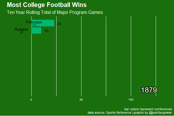
Rolling 10-year winners
rolling_wins_chart <- team_record_final %>%
  filter(rank_r10_wins %in% 1:10 & rolling_wins_10yr > 0) %>%
  ggplot(aes(rank_r10_wins * -1, group = school)) +
  geom_tile(aes(
    y = rolling_wins_10yr / 2,
    height = rolling_wins_10yr,
    width = 0.9,
    fill = conf
  ),
  alpha = 0.9) +
  geom_text(
    aes(y = rolling_wins_10yr, label = school),
    nudge_y = -20,
    nudge_x = .2,
    size = 4
  ) +
  geom_text(
    aes(y = rolling_wins_10yr, label = conf),
    nudge_y = -20,
    nudge_x = -.2,
    size = 2.5
  ) +
  geom_text(aes(y = rolling_wins_10yr, label = as.character(rolling_wins_10yr)), nudge_y = 5) +
  geom_shadowtext(aes(
    x = -10,
    y = 118,
    label = paste0(year)
  ),
  size = 8,
  color = 'white') +
  coord_cartesian(clip = "off", expand = FALSE) +
  coord_flip() +
  labs(
    title = 'Most College Football Wins',
    subtitle = 'Ten Year Rolling Total of Major Program Games',
    caption = 'bar colors represent conferences\ndata source: Sports Reference | graphic by @joshfangmeier',
    x = '',
    y = ''
  ) +
  transition_states(year,
                    transition_length = 4, state_length = 3) +
  ease_aes('cubic-in-out')
There is a lot of noise from year to year among the top 10 by rolling win total (as you would expect!), but the plot really does show the rise of certain programs (Notre Dame, Oklahoma, Miami, Alabama). Also, it’s fascinating to see the variation over time in win totals necessary to be at the top.
I’m also pleased with how the conference membership is displayed and how it clearly shows when a school changes conferences, like when Nebraska moved from the Big 8 to the Big 12 in 1990s.
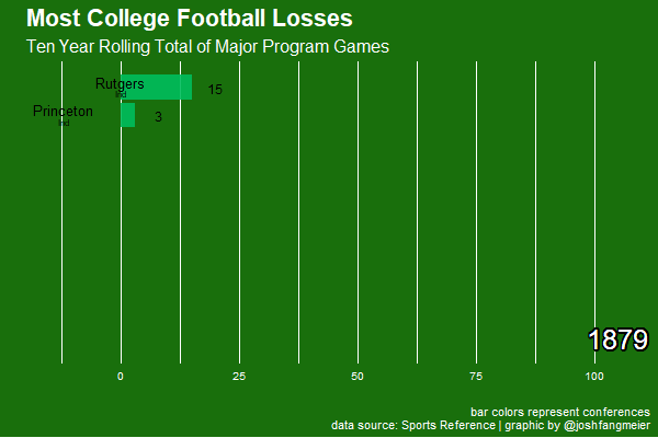
… and rolling 10-year losers
rolling_losses_chart <- team_record_final %>%
  filter(rank_r10_losses %in% 1:10 & rolling_losses_10yr > 0) %>%
  ggplot(aes(rank_r10_losses * -1, group = school)) +
  geom_tile(
    aes(
      y = rolling_losses_10yr / 2,
      height = rolling_losses_10yr,
      width = 0.9,
      fill = conf
    ),
    alpha = 0.9
  ) +
  geom_text(
    aes(y = rolling_losses_10yr, label = school),
    nudge_y = -15,
    nudge_x = .2,
    size = 4
  ) +
  geom_text(
    aes(y = rolling_losses_10yr, label = conf),
    nudge_y = -15,
    nudge_x = -.2,
    size = 2.5
  ) +
  geom_text(aes(y = rolling_losses_10yr, label = as.character(rolling_losses_10yr)), nudge_y = 5) +
  geom_shadowtext(aes(
    x = -10,
    y = 105,
    label = paste0(year)
  ),
  size = 8,
  color = 'white') +
  coord_cartesian(clip = "off", expand = FALSE) +
  coord_flip() +
  labs(
    title = 'Most College Football Losses',
    subtitle = 'Ten Year Rolling Total of Major Program Games',
    caption = 'bar colors represent conferences\ndata source: Sports Reference | graphic by @joshfangmeier',
    x = '',
    y = ''
  ) +
  transition_states(year,
                    transition_length = 4, state_length = 3) +
  ease_aes('cubic-in-out')
K-State fans might want to look away.
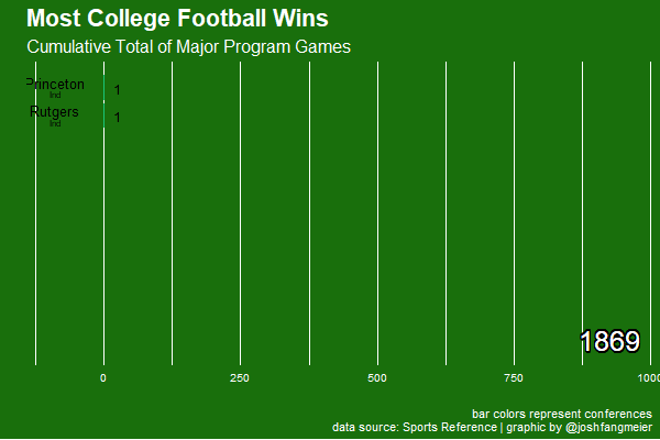
All time winners
alltime_wins_chart <- team_record_final %>%
  filter(rank_cm_wins %in% 1:10 & cumulative_wins > 0) %>%
  ggplot(aes(rank_cm_wins * -1, group = school)) +
  geom_tile(aes(
    y = cumulative_wins / 2,
    height = cumulative_wins,
    width = 0.9,
    fill = conf
  ),
  alpha = 0.9) +
  geom_text(
    aes(y = cumulative_wins, label = school),
    nudge_y = -90,
    nudge_x = .2,
    size = 4
  ) +
  geom_text(
    aes(y = cumulative_wins, label = conf),
    nudge_y = -90,
    nudge_x = -.2,
    size = 2.5
  ) +
  geom_text(aes(y = cumulative_wins, label = as.character(cumulative_wins)), nudge_y = 25) +
  geom_shadowtext(aes(
    x = -10,
    y = 925,
    label = paste0(year)
  ),
  size = 8,
  color = 'white') +
  coord_cartesian(clip = "off", expand = FALSE) +
  coord_flip() +
  labs(
    title = 'Most College Football Losses',
    subtitle = 'Cumulative Total of Major Program Games',
    caption = 'bar colors represent conferences\ndata source: Sports Reference | graphic by @joshfangmeier',
    x = '',
    y = ''
  ) +
  transition_states(year,
                    transition_length = 4, state_length = 3) +
  ease_aes('cubic-in-out')
To wrap this up, I also generated a plot of cumulative wins. This plot clearly shows how much of a lead the Ivy League developed from their early start and how they all dropped out of the top 10 once they stopped playing major football in 1981.